The new Basilicata Energia logo modernizes its key symbols: the light bulb and the Basilicata map. The minimal, contemporary design preserves the brand’s connection to the region while enhancing its identity. A solid and balanced typography reinforces recognition and visual consistency.
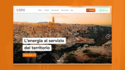
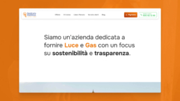
The website has been redesigned to offer an intuitive and accessible experience. A clear structure, smooth navigation, and modern design highlight the company’s values, ensuring easily accessible information and a visually cohesive interface aligned with the new brand.