The Luppolino is a small gem just outside Padua, where a passion for craft beer meets the authenticity of a cozy and genuine venue. With a carefully curated selection of specialty beers and a menu that highlights quality ingredients, it’s the perfect spot for those seeking an authentic experience, far from the ordinary. Its slogan – “Small, Authentic, Craft” – captures the essence of the place: an intimate, sincere, and taste-driven destination.
AGENCY
Freelance
Client
Luppolino
Year
2025
Role
Art-director, Designer
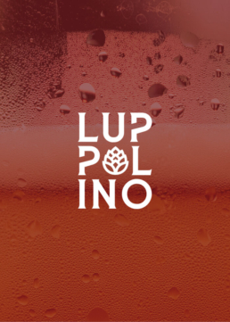
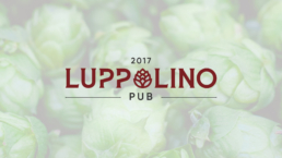
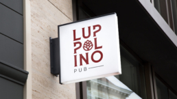
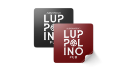
For Luppolino’s rebranding, I developed a visual identity that embodies authenticity and craftsmanship. The logo was redesigned around its key element: the hop, reimagined in a stylized and distinctive form. I created custom lettering by selecting and modifying a font to enhance the brand’s authentic character. To add dynamism, I adjusted the two “pp” and incorporated the stylized hop within the first “O” of the name.
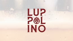
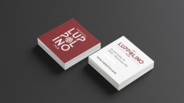
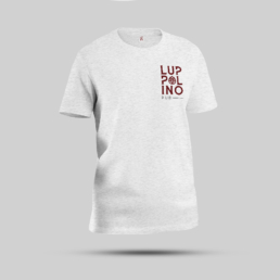
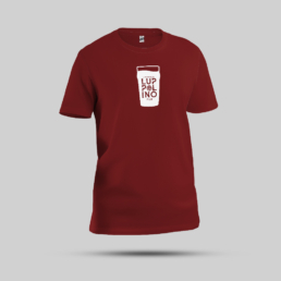
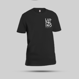
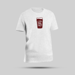
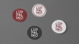
The logo was designed in two versions: an extended one for official use and a vertical one tailored for various applications, such as t-shirts, coasters, business cards, and stickers. The result is a cohesive, modern visual identity that perfectly aligns with the soul of the venue.