Fontday - The art behind the typefaces 001
Welcome to Fontday, our journey into the captivating world of typography. Join us as we explore the nuances, elegance, and power behind the fonts that shape our visual experiences. From classic serifs to contemporary sans-serifs, we delve into the stories, trends, and innovations driving the evolution of typefaces. Get ready to immerse yourself in the artistry and functionality of fonts, where every stroke tells a story. Let's embark on this typographic adventure together!
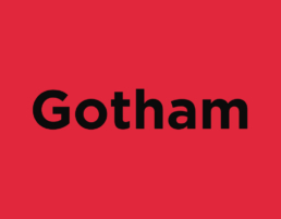
Let's kick off this font-focused collection with a tribute to my personal favorite: Gotham.
Exploring Gotham Font: From History to Iconic Usage
Introduction: Unveiling Gotham
In the vast landscape of typography, few fonts possess the timeless appeal and modern elegance of Gotham. Developed by renowned typographer Jonathan Hoefler and Tobias Frere-Jones, Gotham made its debut in 2000. Inspired by the architectural signage of New York City, Gotham embodies the city's boldness, clarity, and efficiency. Its clean lines and balanced proportions have made it a favorite among designers for a wide range of applications, from print to digital media.
A Glimpse into Gotham's History
Gotham's roots can be traced back to the early 2000s when it was commissioned by GQ magazine for their rebranding. Its creators, Hoefler and Frere-Jones, sought to craft a versatile typeface that captured the essence of Gotham City's iconic signage while offering unparalleled legibility and style. The result was a triumph – a font that exuded both modernity and timelessness.
Features and Characteristics
Gotham's design is characterized by its clean, geometric shapes and even strokes. It boasts a wide range of weights and styles, from light to ultra-bold, making it suitable for various design needs. Whether used for headlines, body text, or branding, Gotham maintains its clarity and impact across different sizes and mediums. Its neutrality allows it to adapt seamlessly to diverse design aesthetics, making it a go-to choice for designers worldwide.
Obama's Presidency and the Legacy of Gotham
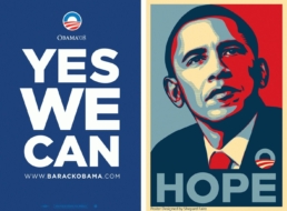
One of the most notable chapters in Gotham's history is its prominent use during Barack Obama's presidency of the United States. The font became synonymous with Obama's iconic "HOPE" poster created by artist Shepard Fairey during the 2008 presidential campaign. Fairey's bold graphic, featuring Obama's face and the word "HOPE" in uppercase Gotham, captured the imagination of millions and became a symbol of optimism and change.
Throughout his presidency, Gotham remained a consistent presence in Obama's branding and communication materials. From campaign signage to official documents, the font became intrinsically linked with the Obama administration's message of progress, inclusivity, and forward-thinking leadership.
Obama's strategic use of Gotham reflects its versatility and ability to convey a sense of authority and modernity while remaining approachable and inclusive. By embracing Gotham, Obama effectively leveraged typography as a powerful tool for communication and branding, leaving an indelible mark on both the political and design landscapes.
Conclusion: Gotham's Enduring Legacy
As we reflect on Gotham's journey from its inception to its iconic usage in Obama's presidency, one thing becomes clear – its enduring legacy transcends mere design trends. Gotham represents more than just a typeface; it embodies the spirit of innovation, resilience, and aspiration. Whether gracing the pages of a magazine, adorning a billboard, or shaping the visual identity of a historic presidency, Gotham continues to captivate and inspire, reminding us of the transformative power of typography in our lives.